
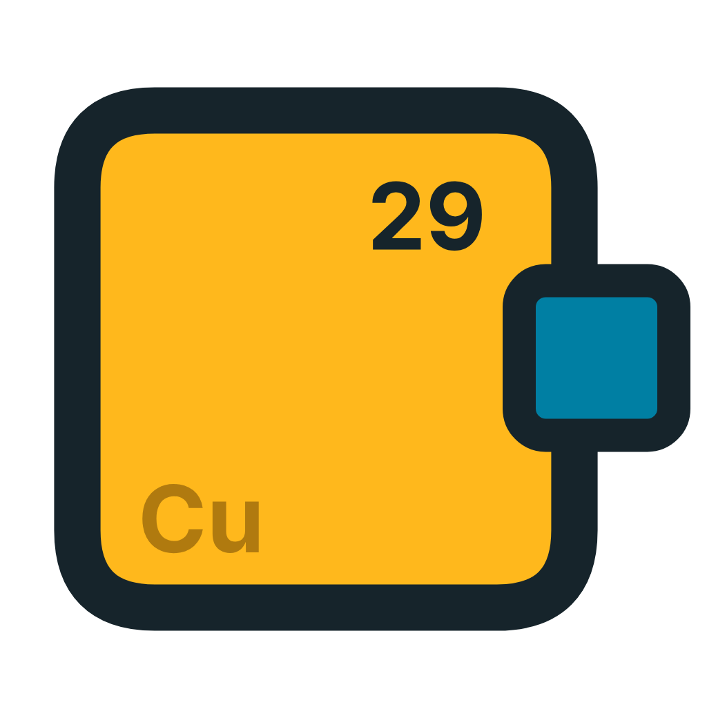
A copper plate with one door
The mark of the Erasmus Office at the Cyprus University of Technology — why it looks the way it does, and how to use it so it keeps working.
The full logo
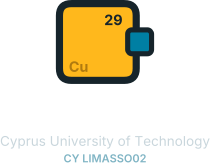
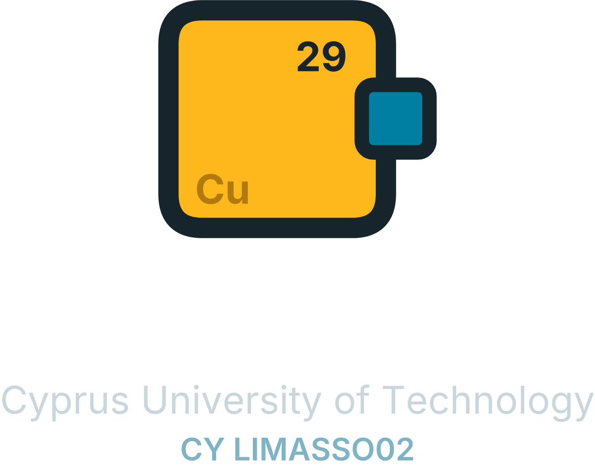
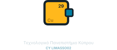
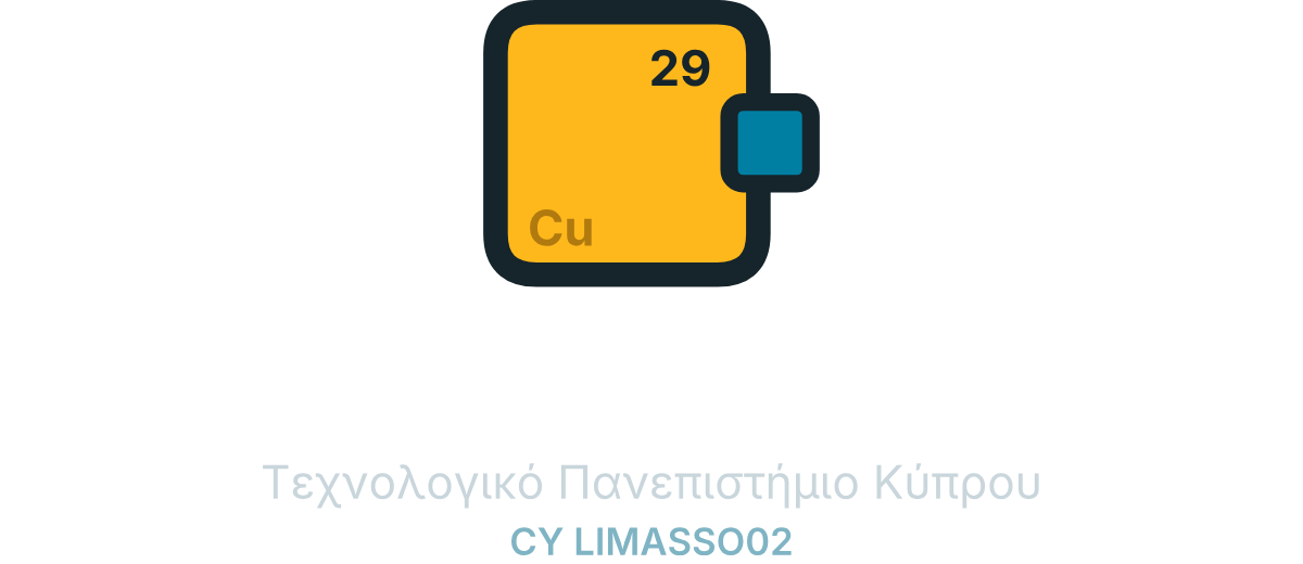
The mark with the name of the office. This is the file to send anyone who asks for “the logo” — English and Greek, horizontal and stacked. SVG for print and design; PNG for Word, PowerPoint and email.



The wordmark is top-justified to the mark — the cap-height of the first line sits on the plate’s top edge. Do not re-space, re-set or translate the lockup yourself; if you need another language or arrangement, ask the office.
On a dark ground
The same logo with the lettering in white. Use it on the CUT navy, on a photograph, on a dark slide — anywhere the dark wordmark would disappear. The plate itself does not change: copper on navy is the contrast, and inverting it would lose the mark.




The PNGs have a transparent background, so they sit on any dark colour without a box around them. There is no white-plate version: on a light ground use the standard logo above, not this one.
How it was arrived at
Seven rounds, and most of them were wrong in a way that taught us something. The reasoning below is recorded in the order the decisions were actually made, because the order is the argument.
- 01
The office had no mark of its own
Everything the office signed carried somebody else’s identity — the University’s, the alliance’s, the Commission’s. There was no mark that said this office, which is why the previous materials borrowed the Erasmus+ wordmark and added a line of their own beneath it.
- 02
Cyprus is where copper got its name
Latin cuprum is a contraction of aes cyprium, “metal of Cyprus”. The island named the element, and the element is number 29. For a university of technology, a periodic-table reference is not decoration — it is the institution speaking in its own register.
- 03
But the copper is not the office
This was the decision that shaped everything else. Copper stands for what Cyprus and CUT actually have to send — the research, the teaching, the students. The office is not that substance. It is what moves it. So the mark had to be the carrier, not the cargo.
- 04
A door, not a broken wall
An early version showed pieces escaping from a block. It was rejected for saying the wrong thing: that Cyprus is somewhere to get away from. The final plate is closed on every side but one, and the opening is deliberate. Nothing breaks out; something passes through. Γραφείο — a room with a door.
- 05
Marked like a component, not labelled like a sign
An integrated circuit carries its part number laser-etched into a corner, small enough that you only find it when you are close. The plate does the same: 29 top right, Cu bottom left, in a copper one shade darker than the plate. Measured at 2.15:1 — legible at arm’s length, invisible across a room.
- 06
Built from the University’s own grammar
CUT’s monogram is a woven field of rectangles on a strict grid: orthogonal shapes only, colour on light, no gradients. The plate obeys the same rules, and both its teals are CUT primaries — #007FA3 and #005F7D — taken straight from the official palette rather than approximated.
- 07
It has to survive company
The mark is never alone. It appears beside the Commission’s Erasmus+ wordmark, the CUT · member of EUt+ lockup and the European Union emblem. That is why it carries a heavy dark keyline around a bright fill: the outline holds it on pale paper, the copper holds it on dark or coloured ground. It was tested on all four before it was accepted.
Anatomy
- The plate
- Copper. What the island has to send, and what the office exists to move.
- The opening
- A gap in the keyline on the right edge, roughly a fifth of that side. The only way in or out, and the reason the mark is not a box.
- The block
- Teal, half in and half out — whatever is travelling today. Teal rather than copper, so it reads as the thing being carried rather than a piece breaking off.
- 29 · Cu
- Atomic number and symbol, etched into opposite corners. Present, quiet, and not the point until you are close enough for it to be.
Palette
Five values, four of them straight from the University’s own palette. Nothing here was invented where an official colour existed.
Two drawings, not one
Below 44 pixels the etched corners and the 4.2-unit keyline stop resolving. A separate small variant ships for those sizes — heavier outline, larger block, no etching. Use it; do not scale the master down and hope.
Clear space
Keep free space of at least a quarter of the plate’s width on all four sides. Nothing — type, rules, other logos, photographic detail — enters the dashed area.
Minimum sizes: 16px on screen, 10mm wide in print. Below that, use the wordmark alone.
Beside the CUT mark
The University comes first. In any lockup where both appear, the CUT · member of EUt+ logo leads and the Office mark follows, separated by a hairline rule and equal optical weight — the Office is a unit of the University, not a peer of it. Never merge the two into a single graphic, and never place the Office mark inside CUT’s.
The dashed slot is the official University asset, obtained from the CUT communications office. It is shown here as a placeholder and is never redrawn.
Beside EUt+ and the European Union
On a call, a grant agreement, a certificate or a poster the mark appears in company. The order runs from the widest authority to the most specific: the European Union emblem with its funding statement, then the Erasmus+ wordmark, then the University with its alliance membership, then this office.
The first three are protected assets belonging to the European Commission, the EUt+ alliance and the University. They are reproduced exactly as supplied — never recoloured, redrawn, cropped, rotated or absorbed into another mark. The Office mark is the only one on that row that we are free to change, and it was designed to be the quiet one.
Use and misuse
Use the supplied SVG. It has no font dependency — the letterforms are outlines.
Keep clear space of at least one quarter of the plate’s width on every side.
Below 26px use the small variant: no etching, heavier keyline. It is a separate file, not the master scaled down.
On dark or photographic ground, place the full-colour mark. It was drawn to hold there.
Do not recolour the plate, the block or the keyline, and never use the etch colour for anything but Cu.
Do not rotate, shear, add shadows, gradients, glows or outlines.
Do not close the doorway, move the block inside the plate, or fill the gap in the keyline.
Do not set the mark inside a circle, badge or coloured tile — the plate is already the container.
Do not redraw, recolour or combine the Erasmus+, CUT or European Union marks with this one.
Files
Every file is vector unless stated, and every one has its letterforms converted to outlines — the mark never depends on a font being installed.
| File | What it is | Use it for |
|---|---|---|
| office-mark.svg | Master, full colour | Everything above 26px |
| office-mark-small.svg | Small variant | Favicons, 16–26px, embroidery, engraving |
| office-mark-mono.svg | One ink, positive | Stamps, letterhead, fax-grade printing |
| office-mark-reversed.svg | One ink, reversed | Single-colour dark grounds |
| lockup-en.svg | Lockup, English | Horizontal — documents, headers |
| lockup-en-stacked.svg | Lockup, English, stacked | Narrow spaces, roll-ups, social |
| lockup-gr.svg | Lockup, Ελληνικά | Horizontal — Greek-language documents |
| lockup-gr-stacked.svg | Lockup, Ελληνικά, stacked | Narrow spaces, Greek |
| lockup-en-reversed.svg | White lockup, English | Horizontal — dark grounds |
| lockup-gr-reversed.svg | White lockup, Ελληνικά | Horizontal — dark grounds |
| lockup-en-stacked-reversed.svg | White lockup, stacked | Narrow spaces on dark |
| office-mark-1024.png | Raster, 1024px | When SVG is not accepted |


Questions about applying the mark, or a use not covered here — write to erasmus@cut.ac.cy.